
Many homes built in the 1980’s and 1990’s boasted an enormous amount of two elements: oak and brass. They were viewed as high end statements and as a result everyone who was anyone wanted to build a house with lots and lots of both.
Today those finishes are the hallmarks of dated days gone by. So what to do if your great new house has a lot of oak and brass? Your options are simple: Either grow that mullet hairstyle back out (party in the back, business in the front) and accept it or rip that junk out and usher in the present decor day.
Brass is usually not so difficult to tackle (a light fixture here, a knob or two there) but the oak? Yeah, unless you want to do a complete remodel you’re just going to have to . . . all at once now . . . paint it.
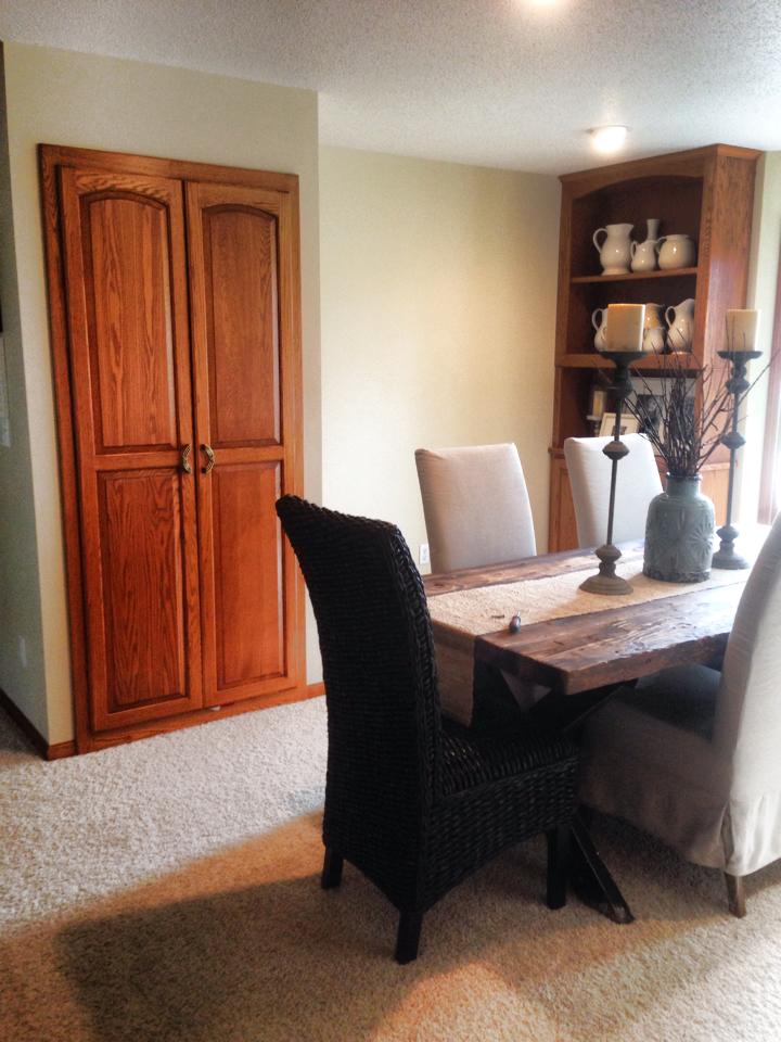
The dining room of The River House was actually so perplexing with its soaring oak built ins and oak finishes that the first time we walked into this room I literally said out loud, “What IS this room?” The house was empty at the time so I had no dining room table to give me a big fat hint and the only lighting was recessed (a chandelier would have been a clue). I didn’t know if it was a home office in need of a door or a second oddly shaped family room.
Through the process of deduction we did eventually figure out, ah HA! – this is the formal dining area. The blueprints we found in one of the closets after we moved in actually not only confirmed our hunch but took the definition of the space a step further as it denoted it as a dining room/library. Ahhhh – yes, because I’ve always wanted to enjoy a steak while reading Shakespeare. So shocking I didn’t walk in and say, “A dining slash library area? I’ve always wanted one of these!”
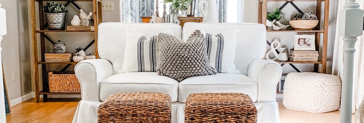
We lived with the oak for about six months before I could not stand it any longer. Even my super adorable rustic dining room table, wicker captain’s chairs and vintage pottery collection could not offset the oakiness.

The time had come.
To paint.
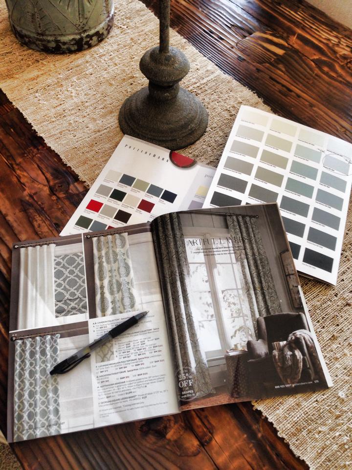
In my plotting I poured over Pottery Barn catalogs for color scheme inspirations and soon settled on a soft blueish grey for the walls, Annie Sloan Chalk Paint in French Grey for the upper shelves and Graphite (black) for the closet doors and lower cabinets.
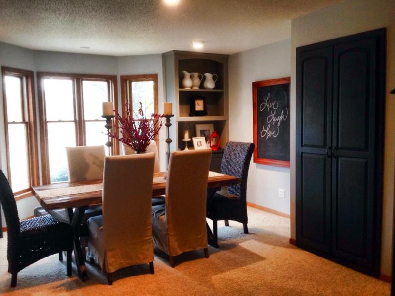
It was, once again, a very long weekend but the end result was worth it. I planned to add drapes in complimentary colors and a colonial shaded chandelier eventually as well – but here was the space after the painting was completed.
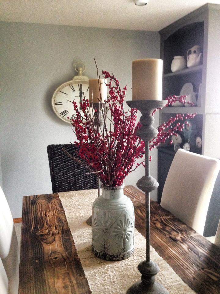

The darker colors on the shelves allowed my lighter pottery collection to stand out far better and the contrast between the walls and painted doors and shelving now showcased these elements as architectural features.
I even ended up switching the direction of the dining table and adding red accent pieces to the final design to balance it all out.


The room came together nicely and the chalk paint investment was significantly less than a full rip and remodel.
Design Tip – Work It
Don’t think that because your home has dated elements you need to break the bank. Work with what you have! Paint outdated cabinetry, update knobs, pulls and light fixtures . . . and Voila! You can have an instantly updated space without any dust, debris or debt.
Design Tip – Color Contrast & Accents
As I stated, my white pieces in the dark shelving provide contrast and you want contrast. Contrast is interesting to the human eye and defines focal points which basically tell your brain to “Look at this!” I love my pottery and pitcher collection so the contrasting colors draw the eye to my collection.
Another color trick is to pick an accent color for your room. Sprinkle it is sparingly. This also draws the eye around the entire room when you space out a few pieces in your accent color. In my dining room I chose a vibrant red and placed three red items in the room. That was all it needed to pull it all together and make it feel interesting and cohesive. Without an accent color your eyes just wander around and the feeling is more cold than cozy.
So no matter what your situation – a dining room/library combo with an explosion of oak or just a standard dated house that needs attention, breathing fresh life into a space is relatively simple (and inexpensive) if you simply take the time to plan a color scheme and pick up a paint brush.
Happy updating!
Peace, Joy and Blessings,
~Audra

Love love! Is this your new home?
LikeLiked by 1 person
Thank you! This is the home we have lived in for two years and have sold. Our new home is The Lighthouse and we have already begun to transform it – I will be sharing before and after pictures on this blog as we embark on our newest design adventures.
LikeLike