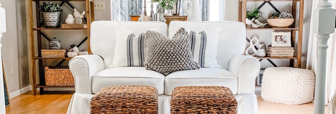
Interior decorating is not static, it is a story made up of several chapters. Whether you’re working on your first home (and notice I didn’t say house, for home is where your heart is whether it is a shared apartment, dorm room or just a little corner of the world that is your very own) or your tenth home, I’ve found that decorating seems to come in seasons. In my first real house back in 1999 I was in an earth tone with accents of red season (complete with an apple themed kitchen). I stayed loyal to my earthy scheme for several years, slowly shifting to taupe and sage green near the tail end. Abruptly, in 2012 I went cool and painted my whole house a soft blue, punctuated by a lot of Pottery Barn. And then, over the past few years I’ve gone grey, white, black and taupe. Neutral, neutral, neutral. Here’s a few photos that highlight my dedication to all things safe and soft . . . color, who needs color?
Even my Christmas decor was neutral!
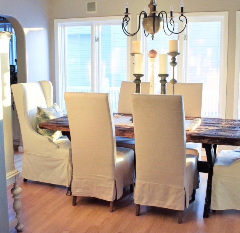
And then all of the sudden, one day, I decided I needed some color. My last blog post documented how I switched our parlor and formal dining room. When that happened I needed to choose window treatments, because hello – look at this nakedness:
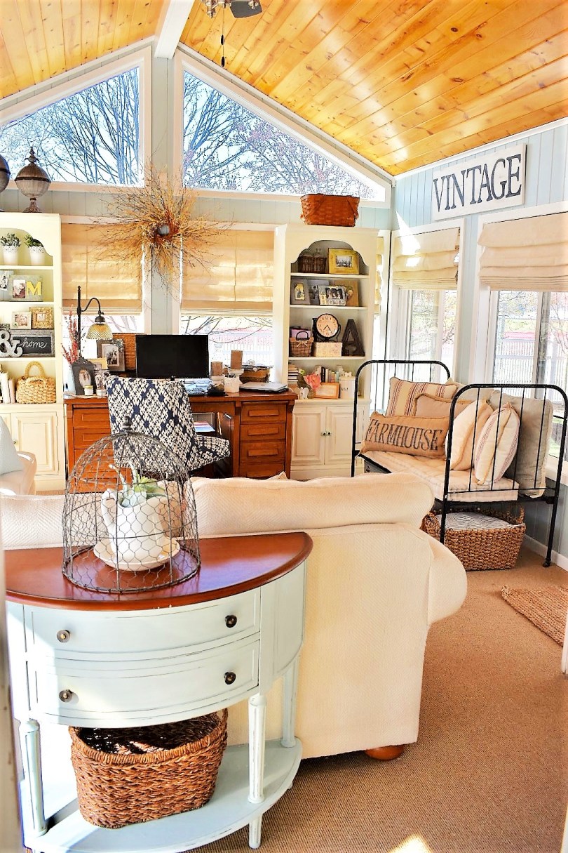
Hmmm, do you think this room needs a little color? Uh, yeah. Talk about boring! So I made a decision. These windows needed color yesterday. What color to choose? Considering this room is right off my sunroom/home office with an entire glass wall between them – all I had to do was look to my right to determine which color I was bringing into the rest of my neutral dullsville living areas . . .
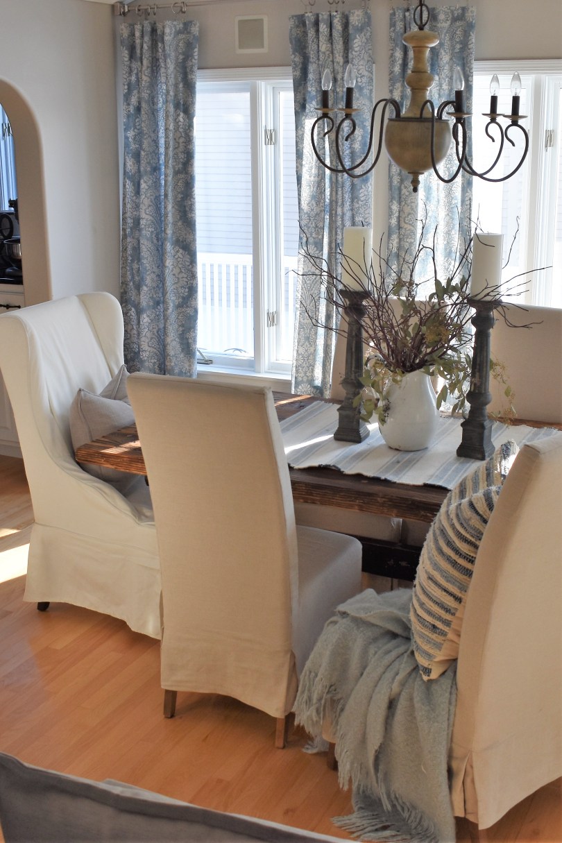
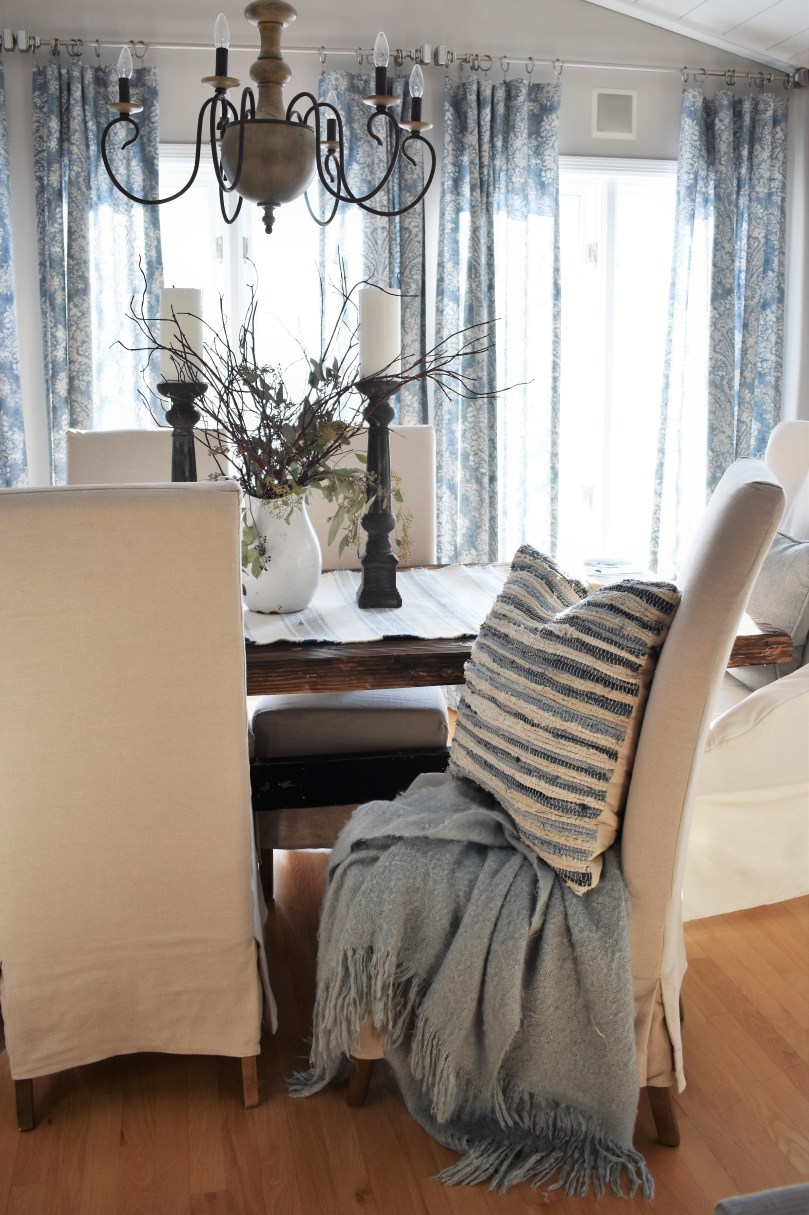
Why, BLUE – of course!
That is just soooooooooo much better, isn’t it?
And so it has begun, my mission to incorporate a lot more blue into my main living areas in 2018. I’ll show you what’s happened so far and note in the captions what I’m planning for each of the following spaces.
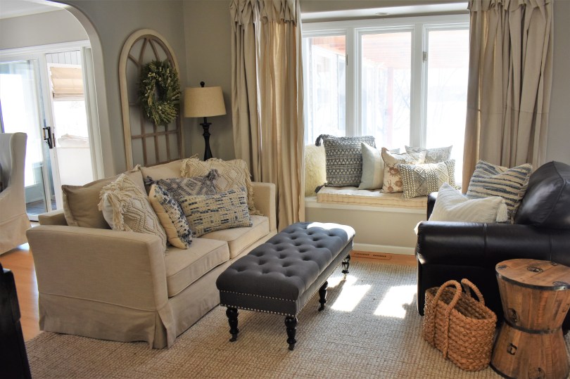
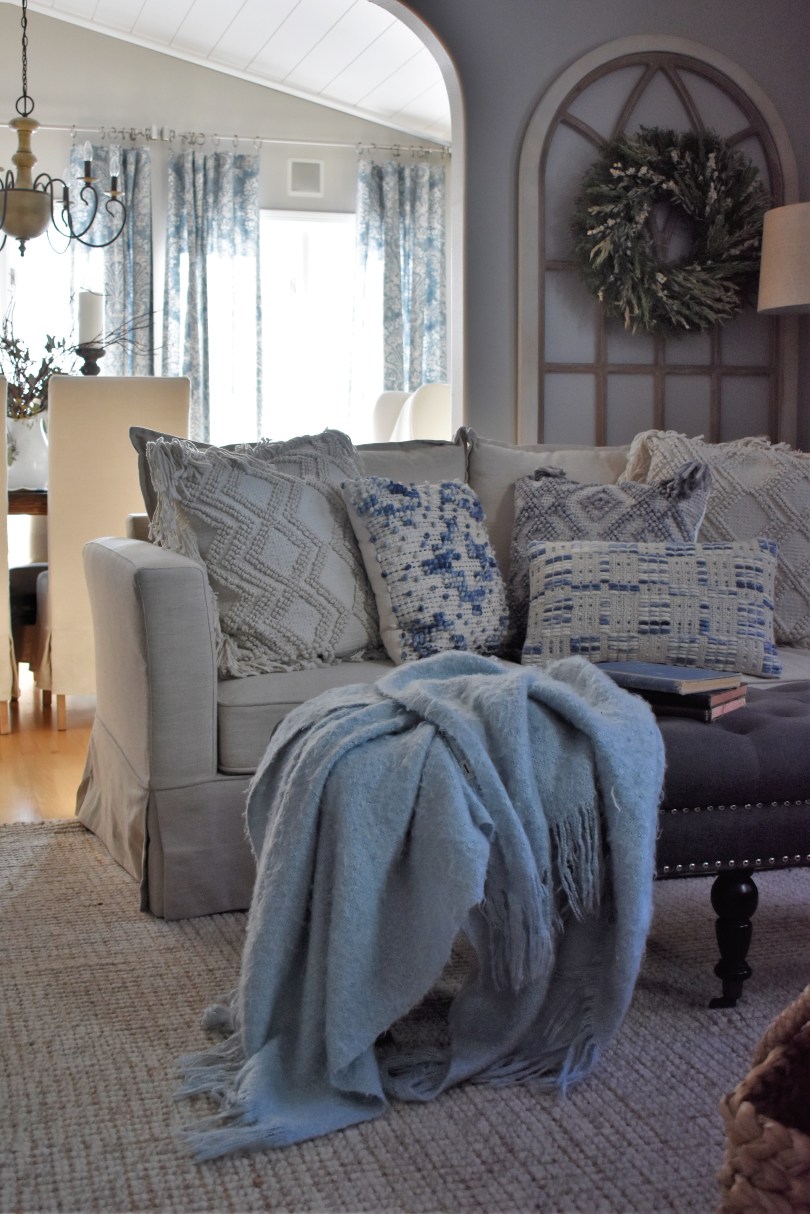
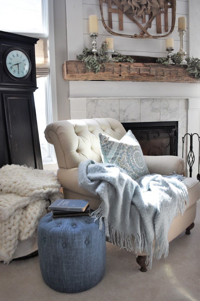
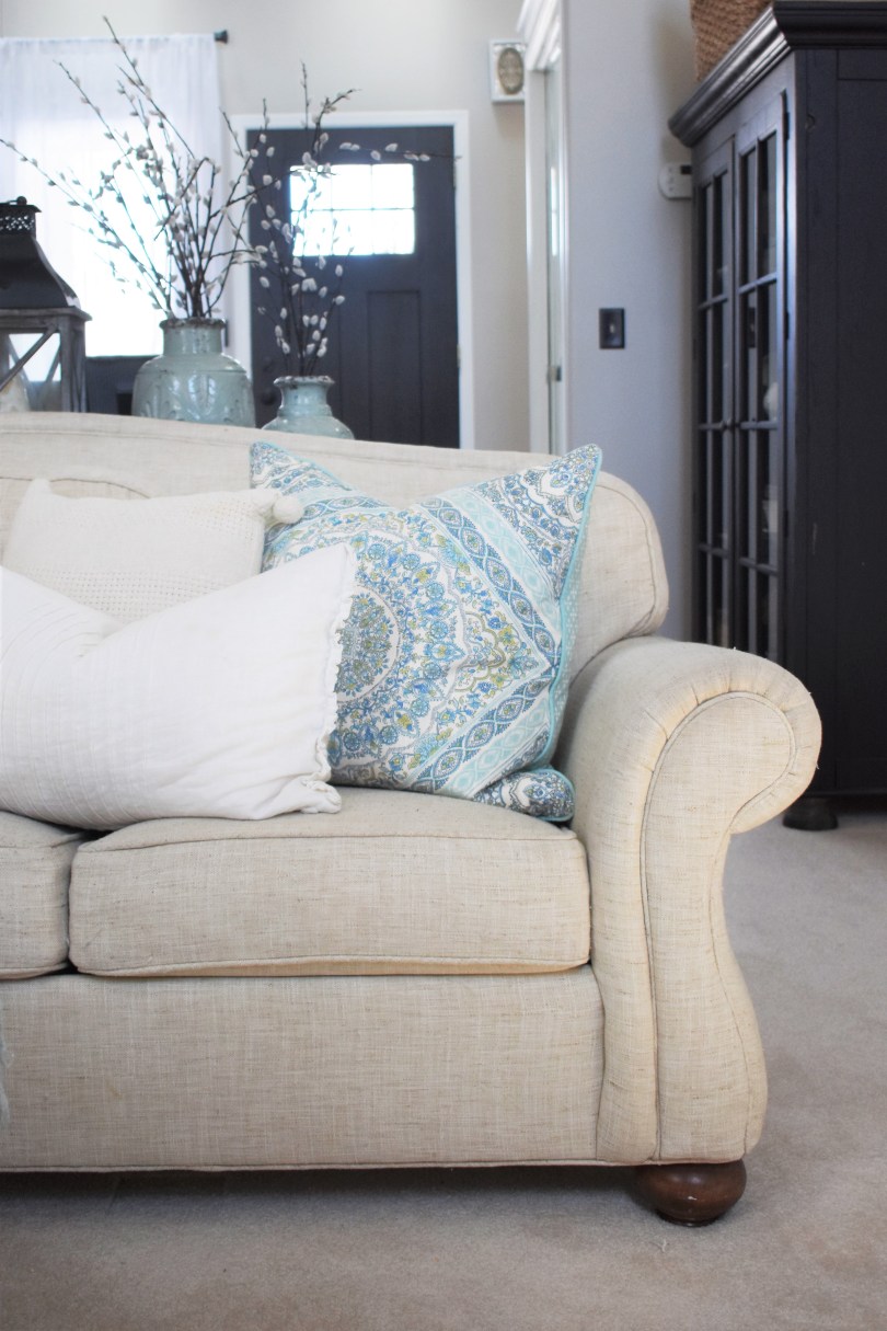
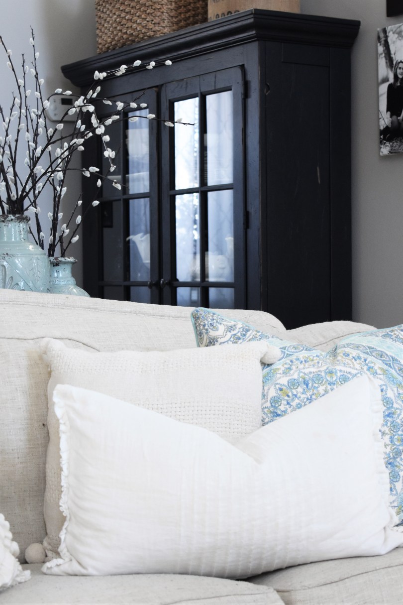
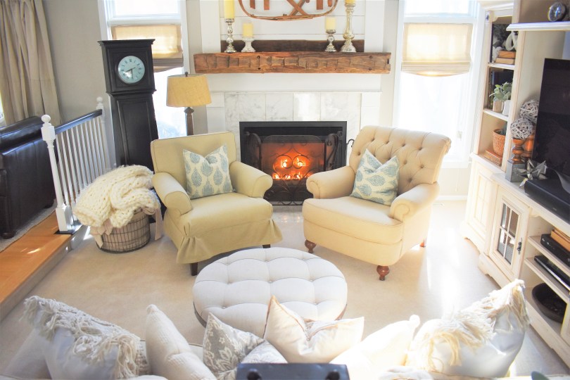
So far my only blue in this space is subtle and found only in a smattering of my Magnolia pillows. I plan to move this Pottery Barn rug into the formal dining room as I have my eye on a couple beautiful blue toned Magnolia contenders to replace it. I also plan on hanging a wood beaded chandelier, finding either a white or great rustic natural wooden coffee table, swapping out the leather chair with something more blue (as well as a side table and lamp) and having a blue patterned window seat cushion sewn. Can you see it? I can!From this angle, the view of my custom Magnolia Hamilton Denim curtain panels brings more blue into this perspective, but I can’t wait to add more.This denim poof I just found a Home Goods a few days ago is drawing on my inspiration – the throw and pillow are after thoughts. I like the pillow because it incorporates several hues of blue into the pattern which will allow me to tie together several blues.Kip is cozy and comfy by the fire – this blue throw is showing up in all my photos as it is one of the soft hues of blue I plan to weave into these rooms.The best part about having a neutral sofa is color schemes are easy to replace – simply slap on a new pillow (or ten!) and you’re in business.
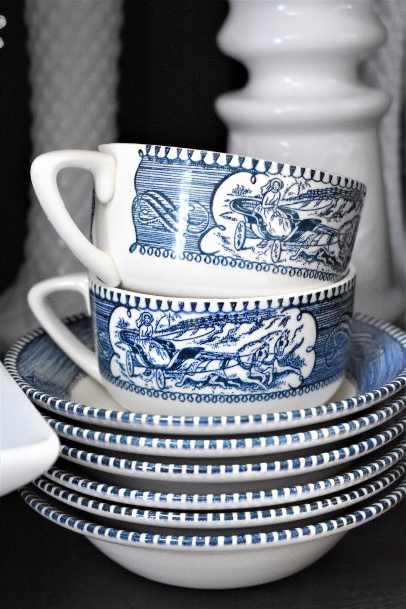
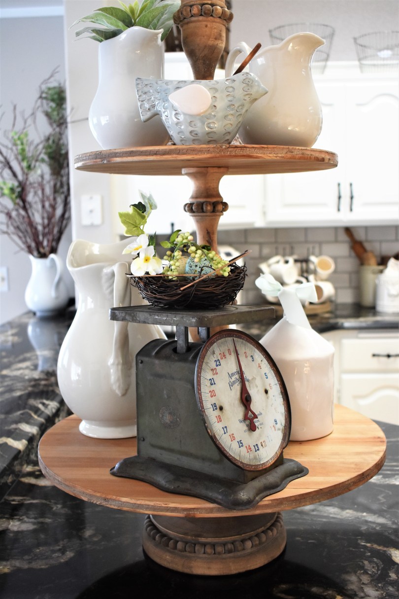
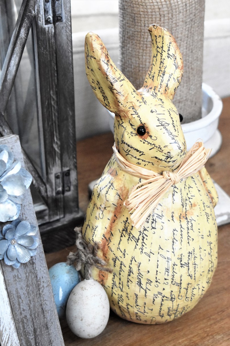
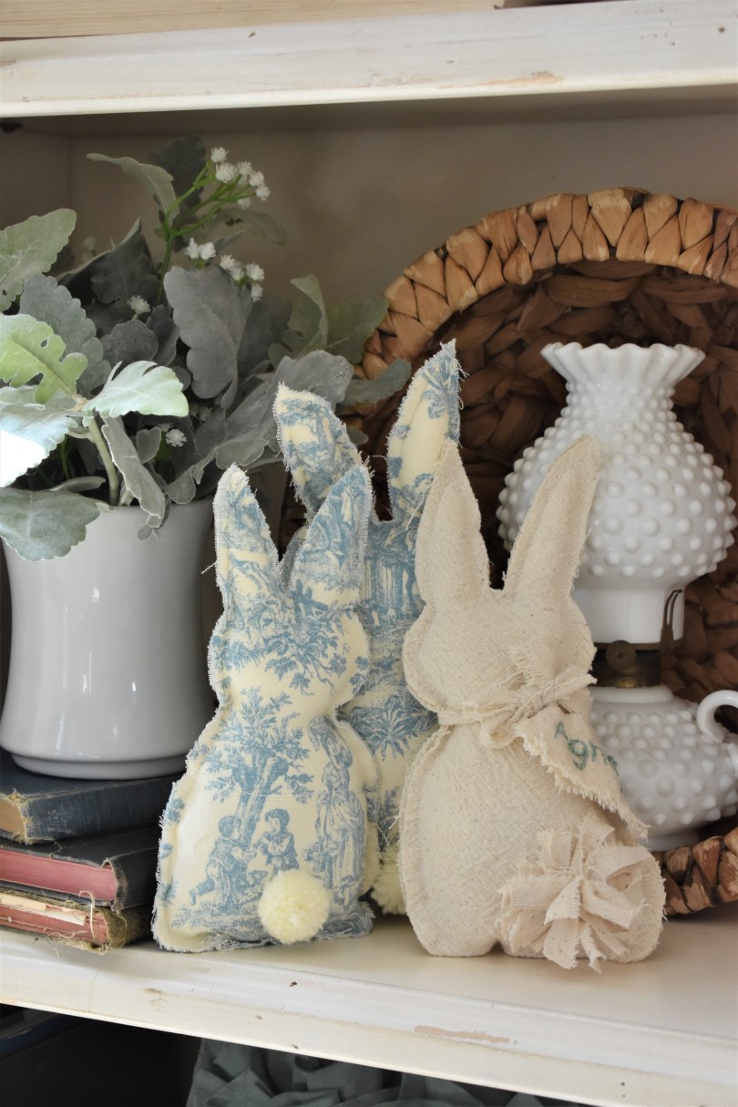
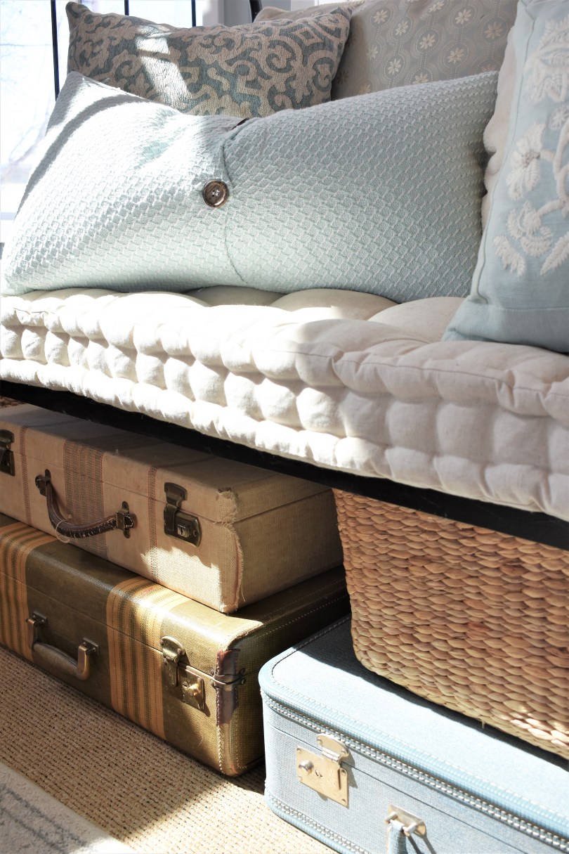
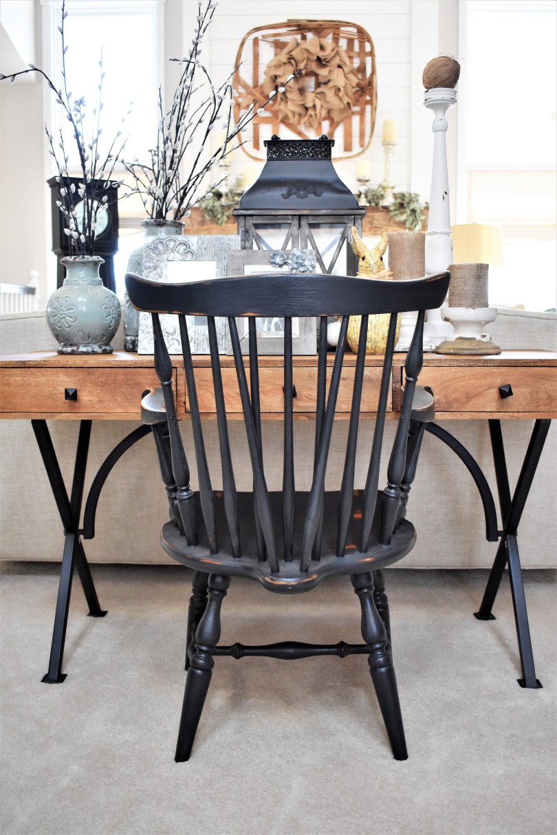
I picked this 40 piece vintage china set up on on our last thrifting/picking adventure for $15. It is my inspiration piece for my new blue and white season.This little blue ceramic bird at Pier One was perfection – had to have him. He’s now bringing some blue into the kitchen.I was fairly minimal in my Easter decor this year, but this adorable bunny (I picked him up at Red Silo a few years ago) is a toting a little blue egg so he fit in beautifully.Speaking of bunnies, these handmade cuties flew out of Grace 1972 this Easter! Of course, I had to have a few of the blue ones for us . . .Sox is enjoying the spring sunshine. These pillows atop the vintage crib in my office illustrate that I may have been on the blue train for a while, I’m finally just incorporating the scheme into our main living areas.And of course, blue and neutral live on in the vintage suitcases beneath my vintage crib. (Although that sage green is a bit of a standout but I just love him. I think he can stay.)I have had these blue pottery pieces on the left side of the desk for a few years now. Like I said, I think blue has always been seeping in, I’m just finally embracing it. (The pussy willow is from Pier One – this is a great spring faux floral to add if you’re on the hunt!)The living room still has a way to go, but for now these matching blue pillows are working just fine as I march slowly toward a color scheme refresh in our living room. Look for this ottoman to be replaced with a FANTASTIC new one that I am having recovered – I can’t wait to show you guys the fabric I found for it. In just a few months, the big reveal should be pretty fun to see.
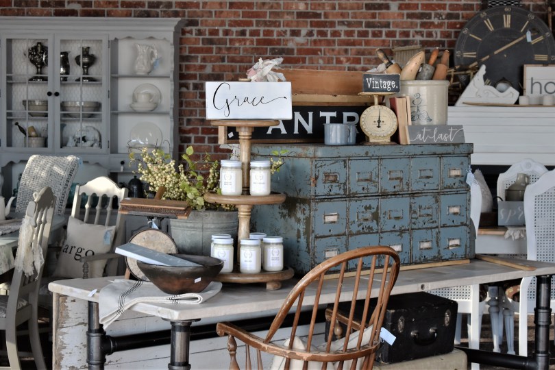
Thank you so much for coming along on my little blue adventure! Watch for items in this color pallet to start showing up at Grace 1972. In fact, I just found the best century old library card catalog in a hue of blue that is just to die for. I’m styling her up today so watch for photo updates on the “Shop Grace 1972” page on the blog in the next few days.
Have a blessed and wonderful spring, friends!
Peace, Joy and Blessings,
~Audra
For everything there is a season, and a time for every purpose under heaven.
Ecclesiastes 3
* * *
Sneak peek! Here is the blue vintage card catalog I found for Grace 1972. Isn’t she a beauty? These are so hard to find. Priced at $399, she will be the perfect addition to any room. ❤